Review of HiDoc Dr. Website (UI/UX Perspect)
The HiDoc Dr. website provides medical professionals and users with a wealth of information and tools. While it has a solid foundation, several areas need improvement to enhance the overall user experience.

INDUSTRY
SaaS
SERVICES
UI/UX Audit
PLATFORM
Website
TIMELINE
2 Weeks
AREAS OF IMPROVEMENT
Identifying Core UX Gaps and Strategic Enhancements
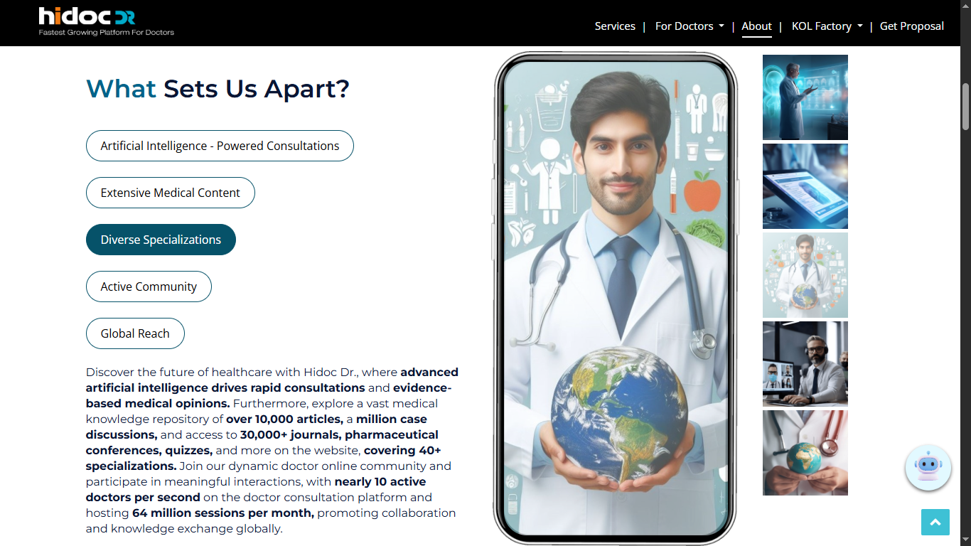
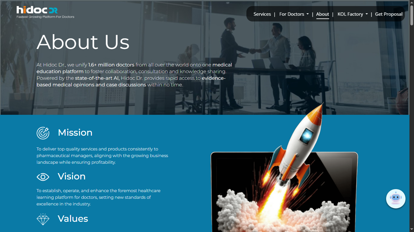
Overall Visual Design & Aesthetics: The website looks dated and inconsistent, using mismatched fonts, color palettes, and layouts. A unified, minimal design with a balanced hierarchy and brand-aligned colors would make the interface modern and visually coherent.
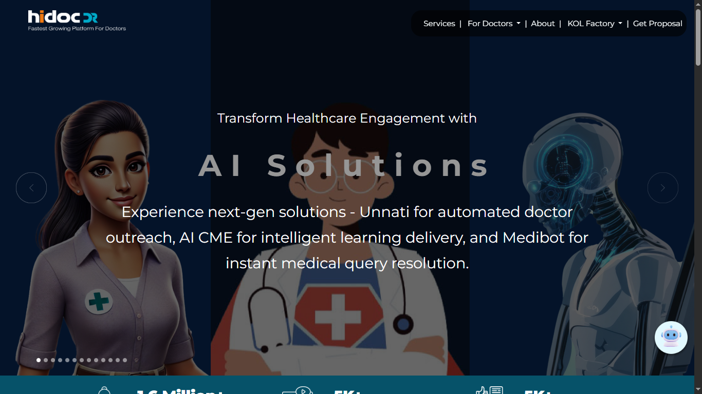
Interactive Elements: The site feels static with minimal interactivity. Introducing personalized recommendations and interactive medical visuals can make the experience more dynamic and engaging.
Accessibility: Accessibility compliance is partial. Adding descriptive alt text, improving color contrast, and enabling keyboard navigation will make the platform inclusive for all users.
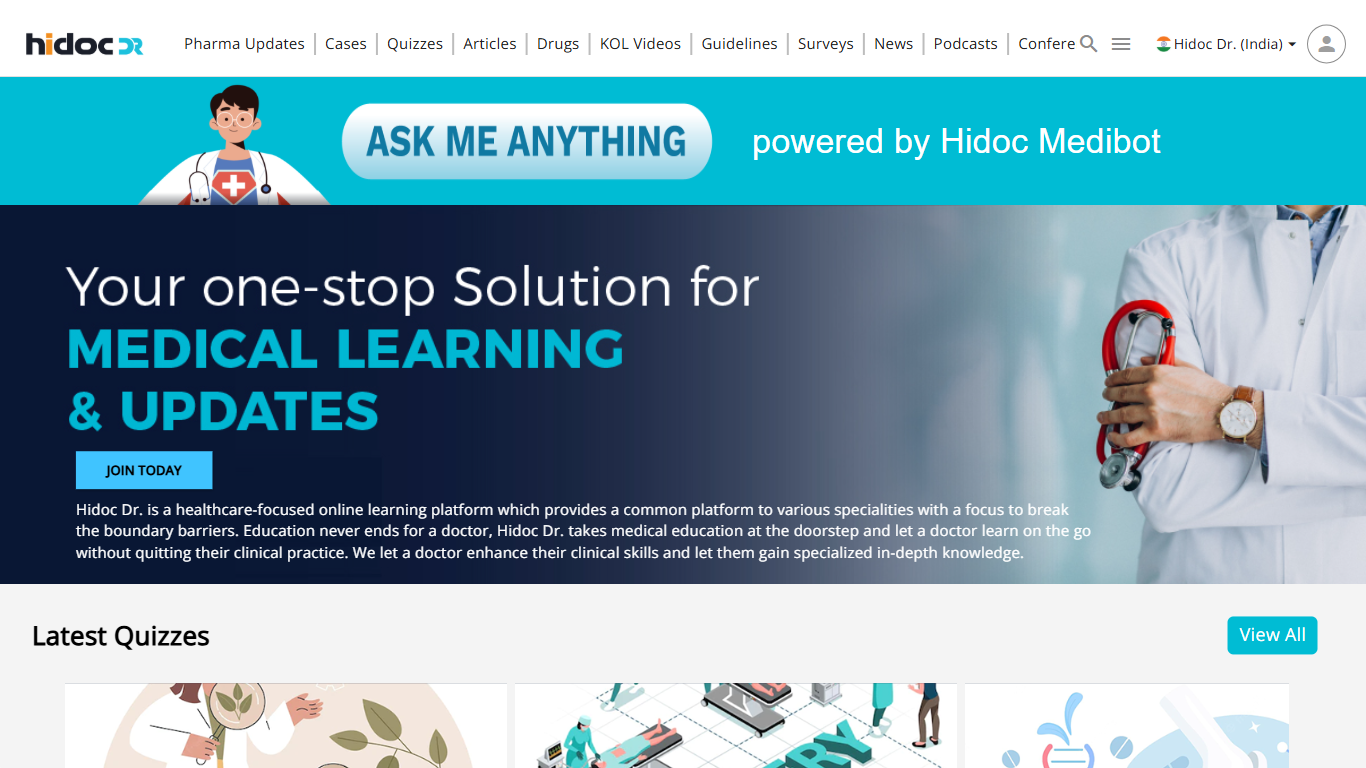
User Engagement: The platform lacks interactive touchpoints that retain user interest. Gamified quizzes, multimedia content, and testimonial-driven stories can improve return engagement and trust.
Content Organization: The content appears overwhelming and scattered. Implementing a card-based structure with intuitive filters and a clear hierarchy will simplify navigation and readability.
Section-Specific Observations
Page-Wise Recommendations for HiDoc Dr.
Articles: Article layouts lack consistency and intuitive navigation. Adding a dedicated search bar, breadcrumb navigation, and organized tagging will enhance readability and exploration.
News Section: The news section feels cluttered with redundant clicks. Structured categories, filters, and increased whitespace will simplify user flow and improve scannability.
Quizzes: The quiz pages are content-heavy and lack progression clarity. Adding concise descriptions, progress indicators, and result summaries will create a smoother and more motivating quiz experience.
Webinars: Webinar layouts are visually inconsistent with other pages. Prominent CTAs, clear schedules, and engagement features like live Q&A or polls can elevate the section’s usability.
Conferences: Conference details are buried within dense layouts. Separating upcoming/past events, improving map visuals, and adding calendar integration will improve discoverability and relevance.
Conclusion
Strengthening HiDoc Dr.’s Digital Experience
By implementing these design and usability recommendations, HiDoc Dr. can evolve into a more credible, engaging, and user-friendly platform for medical professionals.
External Files or Links:
Website: Visit HiDoc http://www.google.com
Audit Report: Visit HiDochttp://www.google.com
PROJECT GALLERY
Visual Snapshots From the Process & Final Delivery
TOOLS & TECHNOLOGIES USED
What Powered This Project

Figma

Zeplin

Miro

Adobe Photoshop
